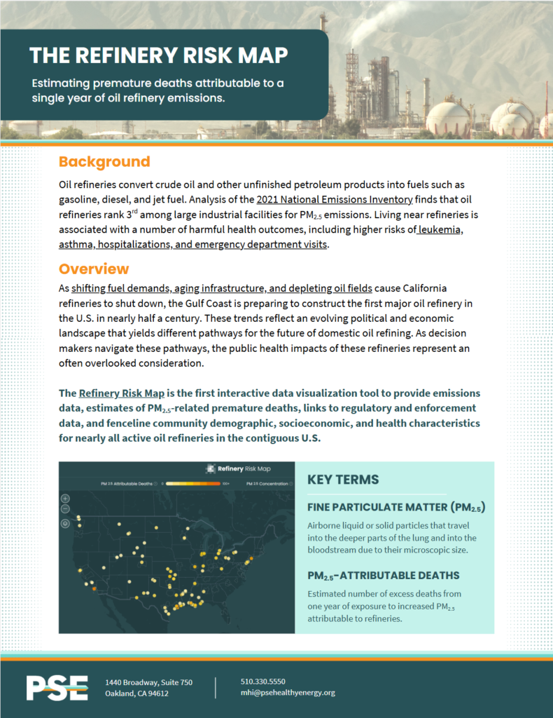
Oil refineries rank third among large industrial facilities for emissions of small particulate pollution (PM2.5). Trying to understand the air quality and human health impacts of oil refineries just got easier with the Refinery Risk Map.
The Refinery Risk Map is a one-of-a-kind interactive data visualization of 126 refineries in the contiguous United States. The map shows the estimated number of deaths attributable to a single year of emissions.
Questions about the Refinery Risk Map?
Email PSE Healthy Energy at mhi@psehealthyenergy.org